Sana Malik
Insight-centric Visualization Recommendation
Mar 21, 2021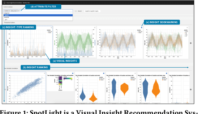
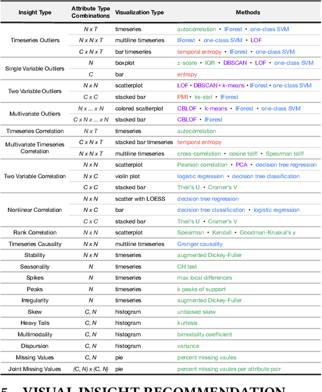

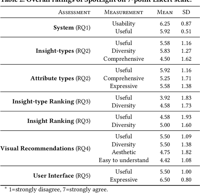
Abstract:Visualization recommendation systems simplify exploratory data analysis (EDA) and make understanding data more accessible to users of all skill levels by automatically generating visualizations for users to explore. However, most existing visualization recommendation systems focus on ranking all visualizations into a single list or set of groups based on particular attributes or encodings. This global ranking makes it difficult and time-consuming for users to find the most interesting or relevant insights. To address these limitations, we introduce a novel class of visualization recommendation systems that automatically rank and recommend both groups of related insights as well as the most important insights within each group. Our proposed approach combines results from many different learning-based methods to discover insights automatically. A key advantage is that this approach generalizes to a wide variety of attribute types such as categorical, numerical, and temporal, as well as complex non-trivial combinations of these different attribute types. To evaluate the effectiveness of our approach, we implemented a new insight-centric visualization recommendation system, SpotLight, which generates and ranks annotated visualizations to explain each insight. We conducted a user study with 12 participants and two datasets which showed that users are able to quickly understand and find relevant insights in unfamiliar data.
Personalized Visualization Recommendation
Feb 12, 2021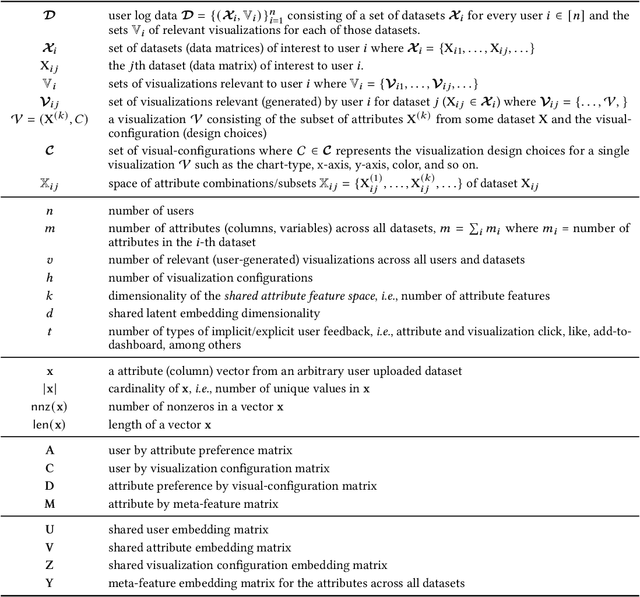
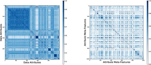

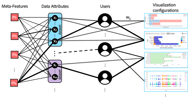
Abstract:Visualization recommendation work has focused solely on scoring visualizations based on the underlying dataset and not the actual user and their past visualization feedback. These systems recommend the same visualizations for every user, despite that the underlying user interests, intent, and visualization preferences are likely to be fundamentally different, yet vitally important. In this work, we formally introduce the problem of personalized visualization recommendation and present a generic learning framework for solving it. In particular, we focus on recommending visualizations personalized for each individual user based on their past visualization interactions (e.g., viewed, clicked, manually created) along with the data from those visualizations. More importantly, the framework can learn from visualizations relevant to other users, even if the visualizations are generated from completely different datasets. Experiments demonstrate the effectiveness of the approach as it leads to higher quality visualization recommendations tailored to the specific user intent and preferences. To support research on this new problem, we release our user-centric visualization corpus consisting of 17.4k users exploring 94k datasets with 2.3 million attributes and 32k user-generated visualizations.
ML-based Visualization Recommendation: Learning to Recommend Visualizations from Data
Sep 25, 2020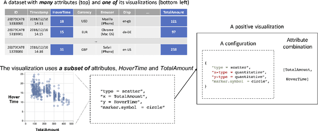
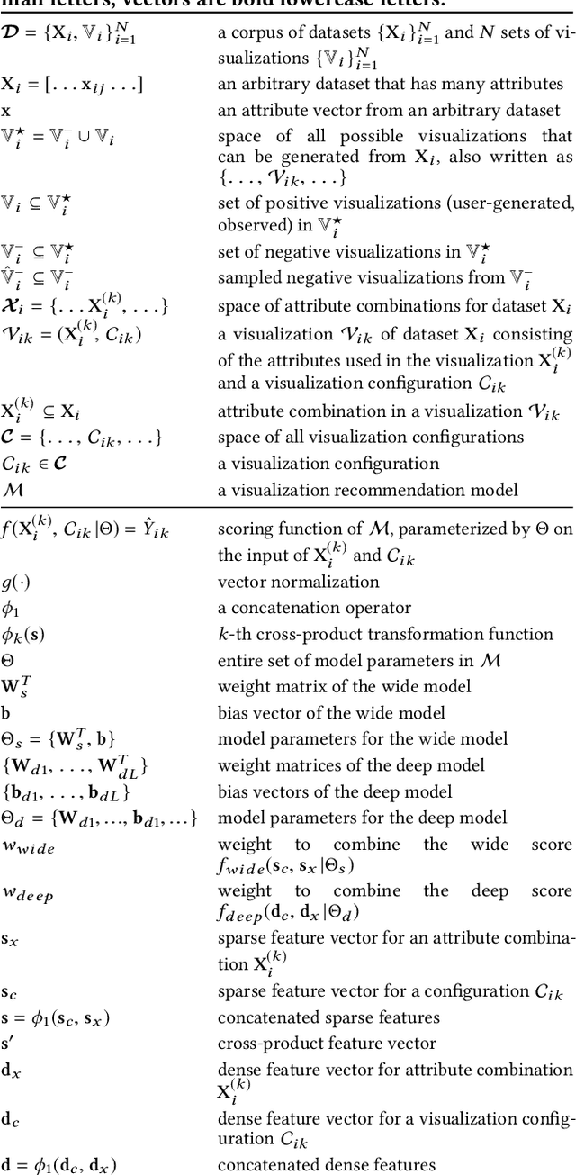
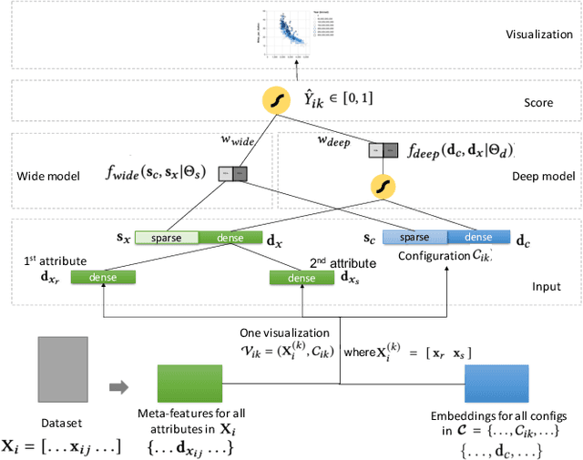

Abstract:Visualization recommendation seeks to generate, score, and recommend to users useful visualizations automatically, and are fundamentally important for exploring and gaining insights into a new or existing dataset quickly. In this work, we propose the first end-to-end ML-based visualization recommendation system that takes as input a large corpus of datasets and visualizations, learns a model based on this data. Then, given a new unseen dataset from an arbitrary user, the model automatically generates visualizations for that new dataset, derive scores for the visualizations, and output a list of recommended visualizations to the user ordered by effectiveness. We also describe an evaluation framework to quantitatively evaluate visualization recommendation models learned from a large corpus of visualizations and datasets. Through quantitative experiments, a user study, and qualitative analysis, we show that our end-to-end ML-based system recommends more effective and useful visualizations compared to existing state-of-the-art rule-based systems. Finally, we observed a strong preference by the human experts in our user study towards the visualizations recommended by our ML-based system as opposed to the rule-based system (5.92 from a 7-point Likert scale compared to only 3.45).
The Impact of Presentation Style on Human-In-The-Loop Detection of Algorithmic Bias
May 09, 2020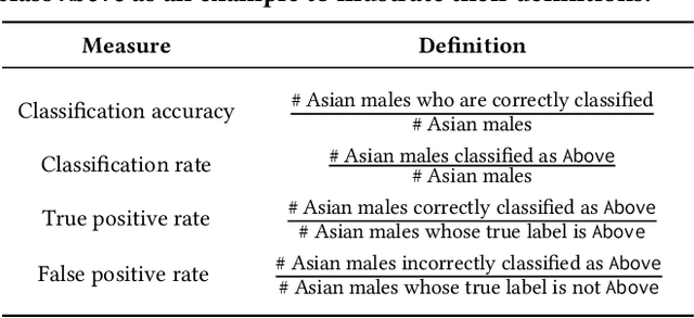

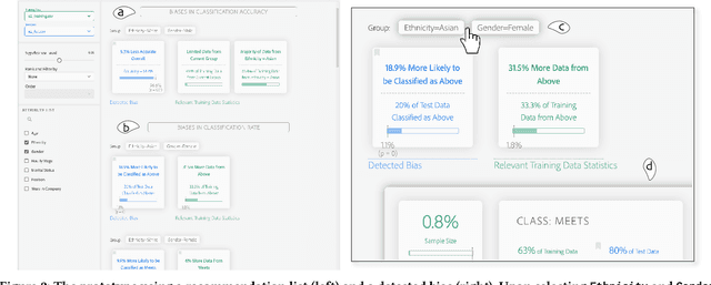

Abstract:While decision makers have begun to employ machine learning, machine learning models may make predictions that bias against certain demographic groups. Semi-automated bias detection tools often present reports of automatically-detected biases using a recommendation list or visual cues. However, there is a lack of guidance concerning which presentation style to use in what scenarios. We conducted a small lab study with 16 participants to investigate how presentation style might affect user behaviors in reviewing bias reports. Participants used both a prototype with a recommendation list and a prototype with visual cues for bias detection. We found that participants often wanted to investigate the performance measures that were not automatically detected as biases. Yet, when using the prototype with a recommendation list, they tended to give less consideration to such measures. Grounded in the findings, we propose information load and comprehensiveness as two axes for characterizing bias detection tasks and illustrate how the two axes could be adopted to reason about when to use a recommendation list or visual cues.
Designing Tools for Semi-Automated Detection of Machine Learning Biases: An Interview Study
Mar 18, 2020Abstract:Machine learning models often make predictions that bias against certain subgroups of input data. When undetected, machine learning biases can constitute significant financial and ethical implications. Semi-automated tools that involve humans in the loop could facilitate bias detection. Yet, little is known about the considerations involved in their design. In this paper, we report on an interview study with 11 machine learning practitioners for investigating the needs surrounding semi-automated bias detection tools. Based on the findings, we highlight four considerations in designing to guide system designers who aim to create future tools for bias detection.
 Add to Chrome
 Add to Firefox
 Add to Edge