Niklas Elmqvist
Data Therapist: Eliciting Domain Knowledge from Subject Matter Experts Using Large Language Models
May 01, 2025Abstract:Effective data visualization requires not only technical proficiency but also a deep understanding of the domain-specific context in which data exists. This context often includes tacit knowledge about data provenance, quality, and intended use, which is rarely explicit in the dataset itself. We present the Data Therapist, a web-based tool that helps domain experts externalize this implicit knowledge through a mixed-initiative process combining iterative Q&A with interactive annotation. Powered by a large language model, the system analyzes user-supplied datasets, prompts users with targeted questions, and allows annotation at varying levels of granularity. The resulting structured knowledge base can inform both human and automated visualization design. We evaluated the tool in a qualitative study involving expert pairs from Molecular Biology, Accounting, Political Science, and Usable Security. The study revealed recurring patterns in how experts reason about their data and highlights areas where AI support can improve visualization design.
Dataopsy: Scalable and Fluid Visual Exploration using Aggregate Query Sculpting
Aug 05, 2023


Abstract:We present aggregate query sculpting (AQS), a faceted visual query technique for large-scale multidimensional data. As a "born scalable" query technique, AQS starts visualization with a single visual mark representing an aggregation of the entire dataset. The user can then progressively explore the dataset through a sequence of operations abbreviated as P6: pivot (facet an aggregate based on an attribute), partition (lay out a facet in space), peek (see inside a subset using an aggregate visual representation), pile (merge two or more subsets), project (extracting a subset into a new substrate), and prune (discard an aggregate not currently of interest). We validate AQS with Dataopsy, a prototype implementation of AQS that has been designed for fluid interaction on desktop and touch-based mobile devices. We demonstrate AQS and Dataopsy using two case studies and three application examples.
CoronaViz: Visualizing Multilayer Spatiotemporal COVID-19 Data with Animated Geocircles
Nov 10, 2022Abstract:While many dashboards for visualizing COVID-19 data exist, most separate geospatial and temporal data into discrete visualizations or tables. Further, the common use of choropleth maps or space-filling map overlays supports only a single geospatial variable at once, making it difficult to compare the temporal and geospatial trends of multiple, potentially interacting variables, such as active cases, deaths, and vaccinations. We present CoronaViz, a COVID-19 visualization system that conveys multilayer, spatiotemporal data in a single, interactive display. CoronaViz encodes variables with concentric, hollow circles, termed geocircles, allowing multiple variables via color encoding and avoiding occlusion problems. The radii of geocircles relate to the values of the variables they represent via the psychophysically determined Flannery formula. The time dimension of spatiotemporal variables is encoded with sequential rendering. Animation controls allow the user to seek through time manually or to view the pandemic unfolding in accelerated time. An adjustable time window allows aggregation at any granularity, from single days to cumulative values for the entire available range. In addition to describing the CoronaViz system, we report findings from a user study comparing CoronaViz with multi-view dashboards from the New York Times and Johns Hopkins University. While participants preferred using the latter two dashboards to perform queries with only a geospatial component or only a temporal component, participants uniformly preferred CoronaViz for queries with both spatial and temporal components, highlighting the utility of a unified spatiotemporal encoding. CoronaViz is open-source and freely available at http://coronaviz.umiacs.io.
Once Upon A Time In Visualization: Understanding the Use of Textual Narratives for Causality
Sep 06, 2020


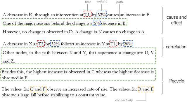
Abstract:Causality visualization can help people understand temporal chains of events, such as messages sent in a distributed system, cause and effect in a historical conflict, or the interplay between political actors over time. However, as the scale and complexity of these event sequences grows, even these visualizations can become overwhelming to use. In this paper, we propose the use of textual narratives as a data-driven storytelling method to augment causality visualization. We first propose a design space for how textual narratives can be used to describe causal data. We then present results from a crowdsourced user study where participants were asked to recover causality information from two causality visualizations--causal graphs and Hasse diagrams--with and without an associated textual narrative. Finally, we describe CAUSEWORKS, a causality visualization system for understanding how specific interventions influence a causal model. The system incorporates an automatic textual narrative mechanism based on our design space. We validate CAUSEWORKS through interviews with experts who used the system for understanding complex events.
 Add to Chrome
 Add to Firefox
 Add to Edge