Sven Hirsch
Benchmarking the CoW with the TopCoW Challenge: Topology-Aware Anatomical Segmentation of the Circle of Willis for CTA and MRA
Dec 29, 2023


Abstract:The Circle of Willis (CoW) is an important network of arteries connecting major circulations of the brain. Its vascular architecture is believed to affect the risk, severity, and clinical outcome of serious neuro-vascular diseases. However, characterizing the highly variable CoW anatomy is still a manual and time-consuming expert task. The CoW is usually imaged by two angiographic imaging modalities, magnetic resonance angiography (MRA) and computed tomography angiography (CTA), but there exist limited public datasets with annotations on CoW anatomy, especially for CTA. Therefore we organized the TopCoW Challenge in 2023 with the release of an annotated CoW dataset and invited submissions worldwide for the CoW segmentation task, which attracted over 140 registered participants from four continents. TopCoW dataset was the first public dataset with voxel-level annotations for CoW's 13 vessel components, made possible by virtual-reality (VR) technology. It was also the first dataset with paired MRA and CTA from the same patients. TopCoW challenge aimed to tackle the CoW characterization problem as a multiclass anatomical segmentation task with an emphasis on topological metrics. The top performing teams managed to segment many CoW components to Dice scores around 90%, but with lower scores for communicating arteries and rare variants. There were also topological mistakes for predictions with high Dice scores. Additional topological analysis revealed further areas for improvement in detecting certain CoW components and matching CoW variant's topology accurately. TopCoW represented a first attempt at benchmarking the CoW anatomical segmentation task for MRA and CTA, both morphologically and topologically.
Visualization and Analysis of Wearable Health Data From COVID-19 Patients
Jan 19, 2022


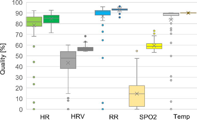
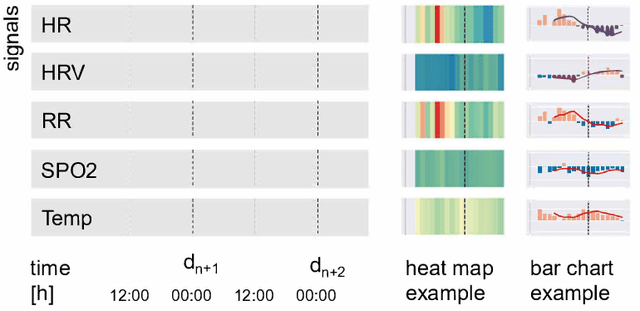
Abstract:Effective visualizations were evaluated to reveal relevant health patterns from multi-sensor real-time wearable devices that recorded vital signs from patients admitted to hospital with COVID-19. Furthermore, specific challenges associated with wearable health data visualizations, such as fluctuating data quality resulting from compliance problems, time needed to charge the device and technical problems are described. As a primary use case, we examined the detection and communication of relevant health patterns visible in the vital signs acquired by the technology. Customized heat maps and bar charts were used to specifically highlight medically relevant patterns in vital signs. A survey of two medical doctors, one clinical project manager and seven health data science researchers was conducted to evaluate the visualization methods. From a dataset of 84 hospitalized COVID-19 patients, we extracted one typical COVID-19 patient history and based on the visualizations showcased the health history of two noteworthy patients. The visualizations were shown to be effective, simple and intuitive in deducing the health status of patients. For clinical staff who are time-constrained and responsible for numerous patients, such visualization methods can be an effective tool to enable continuous acquisition and monitoring of patients' health statuses even remotely.
 Add to Chrome
 Add to Firefox
 Add to Edge