Knowing What VQA Does Not: Pointing to Error-Inducing Regions to Improve Explanation Helpfulness
Paper and Code
Mar 31, 2021


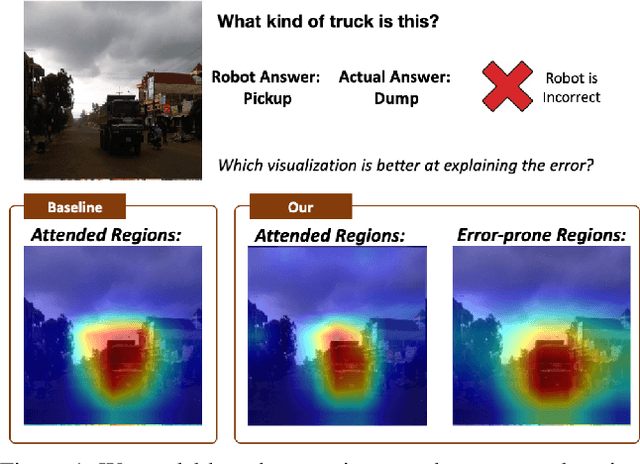
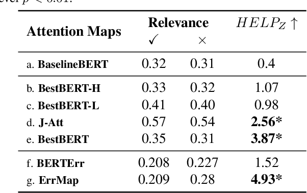
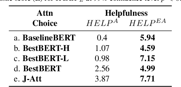
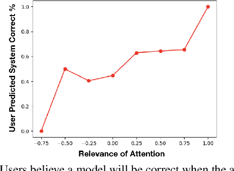
Attention maps, a popular heatmap-based explanation method for Visual Question Answering (VQA), are supposed to help users understand the model by highlighting portions of the image/question used by the model to infer answers. However, we see that users are often misled by current attention map visualizations that point to relevant regions despite the model producing an incorrect answer. Hence, we propose Error Maps that clarify the error by highlighting image regions where the model is prone to err. Error maps can indicate when a correctly attended region may be processed incorrectly leading to an incorrect answer, and hence, improve users' understanding of those cases. To evaluate our new explanations, we further introduce a metric that simulates users' interpretation of explanations to evaluate their potential helpfulness to understand model correctness. We finally conduct user studies to see that our new explanations help users understand model correctness better than baselines by an expected 30% and that our proxy helpfulness metrics correlate strongly ($\rho$>0.97) with how well users can predict model correctness.
 Add to Chrome
 Add to Firefox
 Add to Edge