Human Interpretation of Saliency-based Explanation Over Text
Paper and Code
Jan 27, 2022


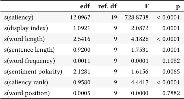
While a lot of research in explainable AI focuses on producing effective explanations, less work is devoted to the question of how people understand and interpret the explanation. In this work, we focus on this question through a study of saliency-based explanations over textual data. Feature-attribution explanations of text models aim to communicate which parts of the input text were more influential than others towards the model decision. Many current explanation methods, such as gradient-based or Shapley value-based methods, provide measures of importance which are well-understood mathematically. But how does a person receiving the explanation (the explainee) comprehend it? And does their understanding match what the explanation attempted to communicate? We empirically investigate the effect of various factors of the input, the feature-attribution explanation, and visualization procedure, on laypeople's interpretation of the explanation. We query crowdworkers for their interpretation on tasks in English and German, and fit a GAMM model to their responses considering the factors of interest. We find that people often mis-interpret the explanations: superficial and unrelated factors, such as word length, influence the explainees' importance assignment despite the explanation communicating importance directly. We then show that some of this distortion can be attenuated: we propose a method to adjust saliencies based on model estimates of over- and under-perception, and explore bar charts as an alternative to heatmap saliency visualization. We find that both approaches can attenuate the distorting effect of specific factors, leading to better-calibrated understanding of the explanation.
 Add to Chrome
 Add to Firefox
 Add to Edge