Viziometrics: Analyzing Visual Information in the Scientific Literature
Paper and Code
May 27, 2016


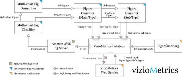
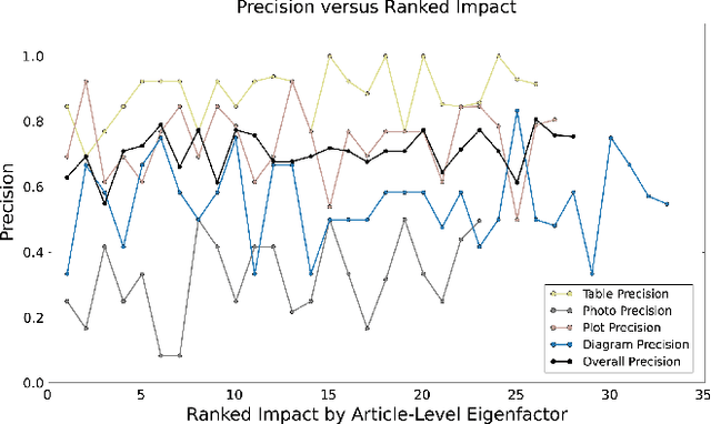
Scientific results are communicated visually in the literature through diagrams, visualizations, and photographs. These information-dense objects have been largely ignored in bibliometrics and scientometrics studies when compared to citations and text. In this paper, we use techniques from computer vision and machine learning to classify more than 8 million figures from PubMed into 5 figure types and study the resulting patterns of visual information as they relate to impact. We find that the distribution of figures and figure types in the literature has remained relatively constant over time, but can vary widely across field and topic. Remarkably, we find a significant correlation between scientific impact and the use of visual information, where higher impact papers tend to include more diagrams, and to a lesser extent more plots and photographs. To explore these results and other ways of extracting this visual information, we have built a visual browser to illustrate the concept and explore design alternatives for supporting viziometric analysis and organizing visual information. We use these results to articulate a new research agenda -- viziometrics -- to study the organization and presentation of visual information in the scientific literature.
 Add to Chrome
 Add to Firefox
 Add to Edge