An Interactive Visualization Tool for Understanding Active Learning
Paper and Code
Nov 09, 2021


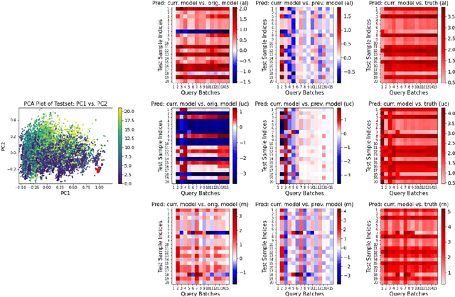
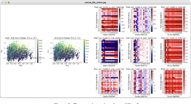
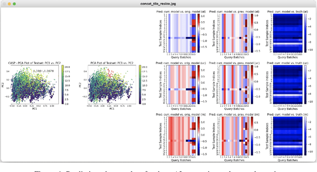
Despite recent progress in artificial intelligence and machine learning, many state-of-the-art methods suffer from a lack of explainability and transparency. The ability to interpret the predictions made by machine learning models and accurately evaluate these models is crucially important. In this paper, we present an interactive visualization tool to elucidate the training process of active learning. This tool enables one to select a sample of interesting data points, view how their prediction values change at different querying stages, and thus better understand when and how active learning works. Additionally, users can utilize this tool to compare different active learning strategies simultaneously and inspect why some strategies outperform others in certain contexts. With some preliminary experiments, we demonstrate that our visualization panel has a great potential to be used in various active learning experiments and help users evaluate their models appropriately.
 Add to Chrome
 Add to Firefox
 Add to Edge