VizExtract: Automatic Relation Extraction from Data Visualizations
Paper and Code
Dec 07, 2021


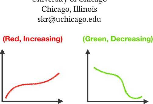
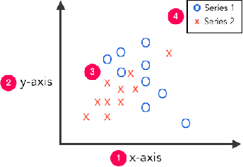
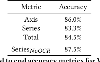
Visual graphics, such as plots, charts, and figures, are widely used to communicate statistical conclusions. Extracting information directly from such visualizations is a key sub-problem for effective search through scientific corpora, fact-checking, and data extraction. This paper presents a framework for automatically extracting compared variables from statistical charts. Due to the diversity and variation of charting styles, libraries, and tools, we leverage a computer vision based framework to automatically identify and localize visualization facets in line graphs, scatter plots, or bar graphs and can include multiple series per graph. The framework is trained on a large synthetically generated corpus of matplotlib charts and we evaluate the trained model on other chart datasets. In controlled experiments, our framework is able to classify, with 87.5% accuracy, the correlation between variables for graphs with 1-3 series per graph, varying colors, and solid line styles. When deployed on real-world graphs scraped from the internet, it achieves 72.8% accuracy (81.2% accuracy when excluding "hard" graphs). When deployed on the FigureQA dataset, it achieves 84.7% accuracy.
 Add to Chrome
 Add to Firefox
 Add to Edge