Visual and semantic interpretability of projections of high dimensional data for classification tasks
Paper and Code
May 22, 2012


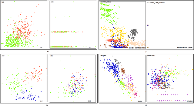
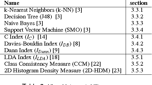
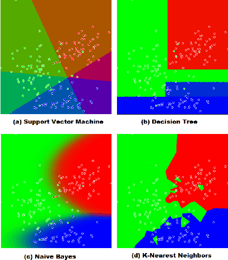
A number of visual quality measures have been introduced in visual analytics literature in order to automatically select the best views of high dimensional data from a large number of candidate data projections. These methods generally concentrate on the interpretability of the visualization and pay little attention to the interpretability of the projection axes. In this paper, we argue that interpretability of the visualizations and the feature transformation functions are both crucial for visual exploration of high dimensional labeled data. We present a two-part user study to examine these two related but orthogonal aspects of interpretability. We first study how humans judge the quality of 2D scatterplots of various datasets with varying number of classes and provide comparisons with ten automated measures, including a number of visual quality measures and related measures from various machine learning fields. We then investigate how the user perception on interpretability of mathematical expressions relate to various automated measures of complexity that can be used to characterize data projection functions. We conclude with a discussion of how automated measures of visual and semantic interpretability of data projections can be used together for exploratory analysis in classification tasks.
 Add to Chrome
 Add to Firefox
 Add to Edge