Rogério E. Garcia
Contrastive analysis for scatter plot-based representations of dimensionality reduction
Jan 26, 2021


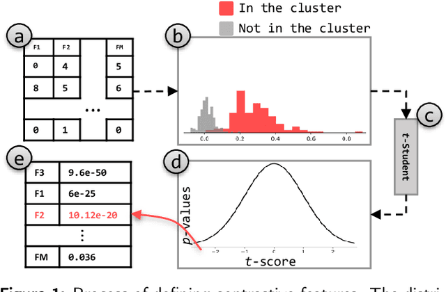
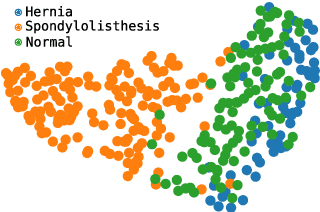
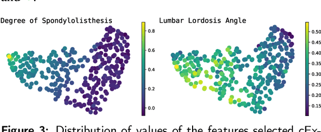
Abstract:Exploring multidimensional datasets is a ubiquitous part of the ones working with data, where interpreting clusters is one of the main tasks. These multidimensional datasets are usually encoded using scatter-plots representations, where spatial proximity encodes similarity among data samples. In the literature, techniques try to understand the scatter plot organization by visualizing the importance of the features for clusters definition with interaction and layout enrichment strategies. However, the approaches used to interpret dimensionality reduction usually do not differentiate clusters well, which hampers analysis where the focus is to understand the differences among clusters. This paper introduces a methodology to visually explore multidimensional datasets and interpret clusters' formation based on the contrastive analysis. We also introduce a bipartite graph to visually interpret and explore the relationship between the statistical variables used to understand how the attributes influenced cluster formation. Our methodology is validated through case studies. We explore a multivariate dataset of patients with vertebral problems and two document collections, one related to news articles and other related to tweets about COVID-19 symptoms. Finally, we also validate our approach through quantitative results to demonstrate how it can be robust enough to support multidimensional analysis.
 Add to Chrome
 Add to Firefox
 Add to Edge