Pranay Kr. Lohia
DataVizard: Recommending Visual Presentations for Structured Data
Nov 14, 2017


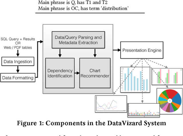
Abstract:Selecting the appropriate visual presentation of the data such that it preserves the semantics of the underlying data and at the same time provides an intuitive summary of the data is an important, often the final step of data analytics. Unfortunately, this is also a step involving significant human effort starting from selection of groups of columns in the structured results from analytics stages, to the selection of right visualization by experimenting with various alternatives. In this paper, we describe our \emph{DataVizard} system aimed at reducing this overhead by automatically recommending the most appropriate visual presentation for the structured result. Specifically, we consider the following two scenarios: first, when one needs to visualize the results of a structured query such as SQL; and the second, when one has acquired a data table with an associated short description (e.g., tables from the Web). Using a corpus of real-world database queries (and their results) and a number of statistical tables crawled from the Web, we show that DataVizard is capable of recommending visual presentations with high accuracy. We also present the results of a user survey that we conducted in order to assess user views of the suitability of the presented charts vis-a-vis the plain text captions of the data.
 Add to Chrome
 Add to Firefox
 Add to Edge