Imanol Arrieta-Ibarra
Metrics of calibration for probabilistic predictions
May 19, 2022


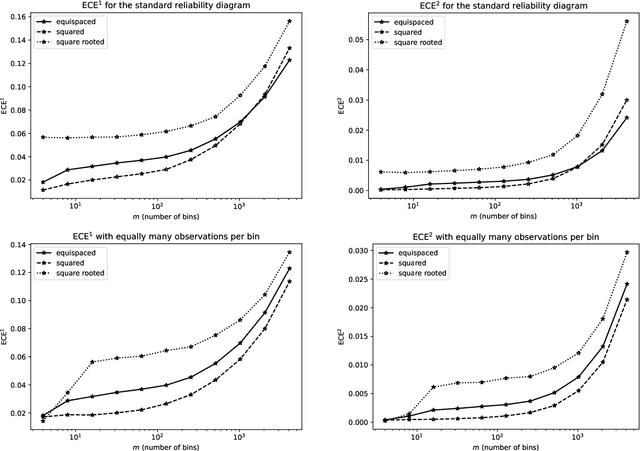
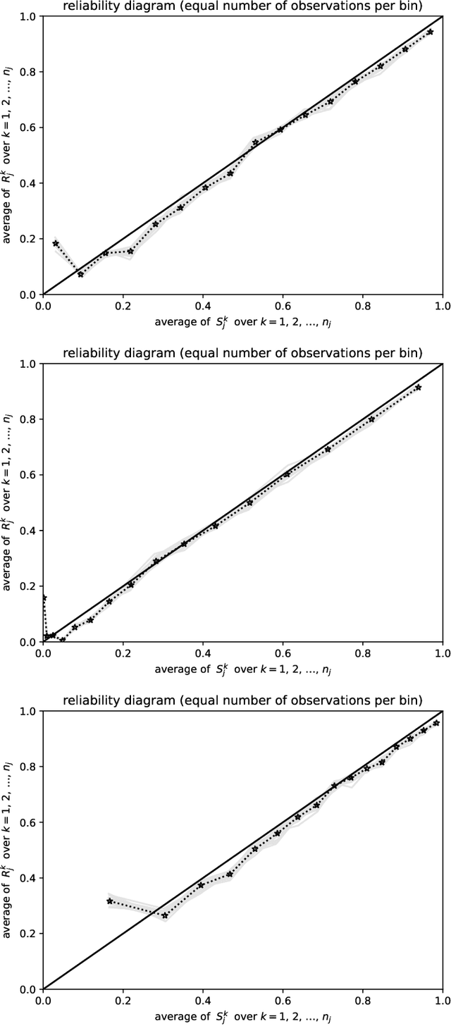
Abstract:Predictions are often probabilities; e.g., a prediction could be for precipitation tomorrow, but with only a 30% chance. Given such probabilistic predictions together with the actual outcomes, "reliability diagrams" help detect and diagnose statistically significant discrepancies -- so-called "miscalibration" -- between the predictions and the outcomes. The canonical reliability diagrams histogram the observed and expected values of the predictions; replacing the hard histogram binning with soft kernel density estimation is another common practice. But, which widths of bins or kernels are best? Plots of the cumulative differences between the observed and expected values largely avoid this question, by displaying miscalibration directly as the slopes of secant lines for the graphs. Slope is easy to perceive with quantitative precision, even when the constant offsets of the secant lines are irrelevant; there is no need to bin or perform kernel density estimation. The existing standard metrics of miscalibration each summarize a reliability diagram as a single scalar statistic. The cumulative plots naturally lead to scalar metrics for the deviation of the graph of cumulative differences away from zero; good calibration corresponds to a horizontal, flat graph which deviates little from zero. The cumulative approach is currently unconventional, yet offers many favorable statistical properties, guaranteed via mathematical theory backed by rigorous proofs and illustrative numerical examples. In particular, metrics based on binning or kernel density estimation unavoidably must trade-off statistical confidence for the ability to resolve variations as a function of the predicted probability or vice versa. Widening the bins or kernels averages away random noise while giving up some resolving power. Narrowing the bins or kernels enhances resolving power while not averaging away as much noise.
 Add to Chrome
 Add to Firefox
 Add to Edge