Silhouettes and quasi residual plots for neural nets and tree-based classifiers
Paper and Code
Jun 16, 2021


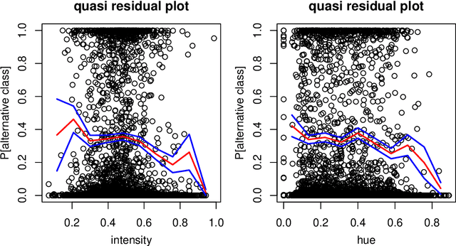
Classification by neural nets and by tree-based methods are powerful tools of machine learning. There exist interesting visualizations of the inner workings of these and other classifiers. Here we pursue a different goal, which is to visualize the cases being classified, either in training data or in test data. An important aspect is whether a case has been classified to its given class (label) or whether the classifier wants to assign it to different class. This is reflected in the (conditional and posterior) probability of the alternative class (PAC). A high PAC indicates label bias, i.e. the possibility that the case was mislabeled. The PAC is used to construct a silhouette plot which is similar in spirit to the silhouette plot for cluster analysis (Rousseeuw, 1987). The average silhouette width can be used to compare different classifications of the same dataset. We will also draw quasi residual plots of the PAC versus a data feature, which may lead to more insight in the data. One of these data features is how far each case lies from its given class. The graphical displays are illustrated and interpreted on benchmark data sets containing images, mixed features, and tweets.
 Add to Chrome
 Add to Firefox
 Add to Edge