Plots of the cumulative differences between observed and expected values of ordered Bernoulli variates
Paper and Code
Jun 03, 2020


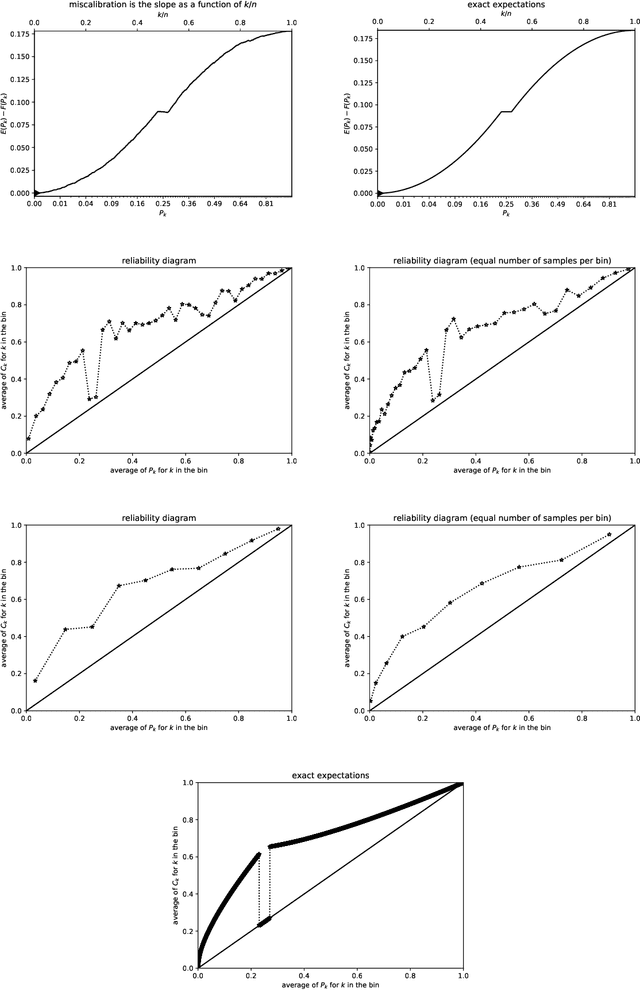
Many predictions are probabilistic in nature; for example, a prediction could be for precipitation tomorrow, but with only a 30 percent chance. Given both the predictions and the actual outcomes, "reliability diagrams" (also known as "calibration plots") help detect and diagnose statistically significant discrepancies between the predictions and the outcomes. The canonical reliability diagrams are based on histogramming the observed and expected values of the predictions; several variants of the standard reliability diagrams propose to replace the hard histogram binning with soft kernel density estimation using smooth convolutional kernels of widths similar to the widths of the bins. In all cases, an important question naturally arises: which widths are best (or are multiple plots with different widths better)? Rather than answering this question, plots of the cumulative differences between the observed and expected values largely avoid the question, by displaying miscalibration directly as the slopes of secant lines for the graphs. Slope is easy to perceive with quantitative precision even when the constant offsets of the secant lines are irrelevant. There is no need to bin or perform kernel density estimation with a somewhat arbitrary kernel.
 Add to Chrome
 Add to Firefox
 Add to Edge