Cluster coloring of the Self-Organizing Map: An information visualization perspective
Paper and Code
Jun 17, 2013


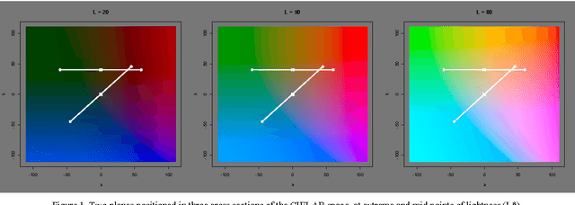
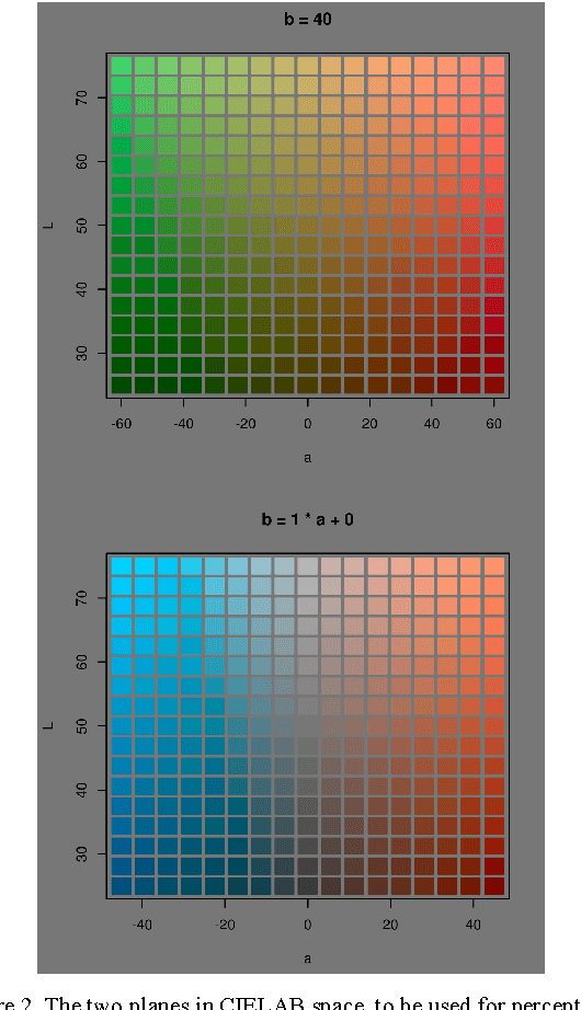
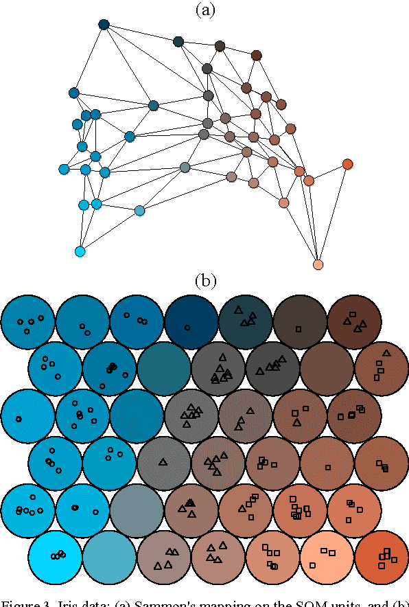
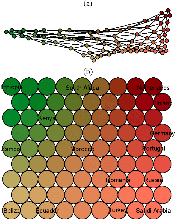
This paper takes an information visualization perspective to visual representations in the general SOM paradigm. This involves viewing SOM-based visualizations through the eyes of Bertin's and Tufte's theories on data graphics. The regular grid shape of the Self-Organizing Map (SOM), while being a virtue for linking visualizations to it, restricts representation of cluster structures. From the viewpoint of information visualization, this paper provides a general, yet simple, solution to projection-based coloring of the SOM that reveals structures. First, the proposed color space is easy to construct and customize to the purpose of use, while aiming at being perceptually correct and informative through two separable dimensions. Second, the coloring method is not dependent on any specific method of projection, but is rather modular to fit any objective function suitable for the task at hand. The cluster coloring is illustrated on two datasets: the iris data, and welfare and poverty indicators.
 Add to Chrome
 Add to Firefox
 Add to Edge